Tuesday 25 February 2014

Task Three: Children's Cookbook


- For my double-page spread I used this recipe from CBeebies.

- The typefaces that I adopted here were SassoonPrimary, JuneGloom and Gills Sans (bold).
SassoonPrimary was used for the large body of text; the instructions and the text below the did-you-knows. This font is specifically designed with young children in mind, as it looks friendly, so I knew it would work. For the titles I adopted the more flamboyant JuneGloom, as its curvy appearance also seemed friendly and playful. Gills Sans Infant is another common font used in children's books, so I used Gills Sans bold for the step titles, as I thought it complimented well with the other typefaces.

- Keeping in mind the young audience, I used bright, primary colours throughout my design. I didn't use many colours but kept to similar shades so that there appeared to be a strong, consistent visual language running throughout these pages.

- My use of collage brings texture to the double-page spread, as well as a fun, playful element. I think that this will appeal to children.

- I feel that my images balance out the amount of text required for this brief. At first, I struggled to find a layout that didn't make the cookbook look overly busy. I played a lot with the "You Will Need" section down the left-hand side to achieve a more balanced effect.

- The design definitely flows between the two pages, as the same visual language has been put into place. The colourful boarders also keep a consistent theme. Perhaps to enhance the flow even more I could have placed an image spreading across both pages.

Task Three: Children's Cookbook Research

Task Three required me to take a recipe from the CBeebies website and create a double-page spread. I therefore researched children's cookbooks to gain an understanding of how they worked.

Roald Dahl's Revolting Recipes
- Famililar illustrations have been put into use.
- Large sections of text. However, the illustrations stop this from appearing overwhelming.
- Colour brings life to the page.
- "What You Need" is usually displayed in a different section at the side.
- Some images travel over the two pages, keeping a consistency.
- Illustrations are fun and creative. They oftern interact with the photographed food.
- Same typefaces used throughout. Playful and larger title, with easy-to-read body text.


Hungry? Innocent's Cookbook
- Sophisticated visual language. Probably aimed more at the parents than children.
- The simplistic layout seems to be: text on one side, photograph on the other. No-fuss. Elegant.
- Recipes broken up with fun activity pages. These pages are very busy, with lots of illustrations. They seem to be aimed more at children, though perhaps slightly older children, around 7-10.
- Very creative book.
- Simple sans-serif type.


Kids' Fun and Healthy Cookbook
- Jaunty, playful typography for titles mixed with tradition serif typefaces for body text.
- Images joined with the "Ingredients" text.
- Warning triangles to show when you need to ask an adult for help, such as when handling knives.
- Photography mixed with text.
- Consistent layout through the double page spread.


Kid's First Cookbook
- Minimal text. Lots of photography.
- Photography is playful. Faces made out of meals etc. 
- Simple, understandable layout.


References:
http://olyeats.wordpress.com/tag/roald-dahls-revolting-recipes/
http://www.creativereview.co.uk/cr-blog/2011/july/innocents-new-hungry-book
http://canadianhomelearning.blogspot.co.uk/2010/05/book-sharing-monday-kids-fun-healthy.html
http://www.dk.co.uk/nf/Book/BookDisplay/0,,9781405370905,00.html?/Kids%27

Thursday 13 February 2014

Task Two

Baby/Toddler - First Objects Book

"First objects" book are educational as well as enjoyable for the young mind. They encourage babies/toddlers to grasp the concepts of day-to-day life. Some recurring features are:
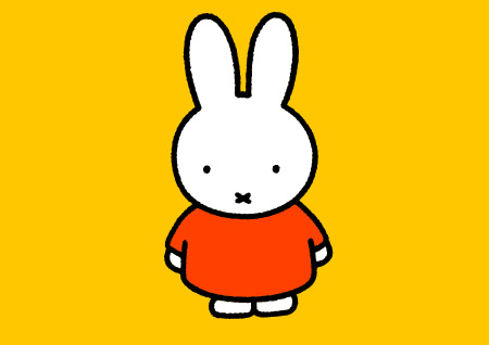
  •  Bright, contrasting colours so that the target audience can distinguish between colours.
  •  Small, usually square books for small hands.
  • Simplistic illustrations to make objects more obvious and identifiable.
  • They can sometimes be tactile, in order to encourage interaction.
  • A few words per page, usually one or two, as the target audience might not be able to read yet.

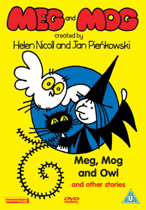
As mentioned in my previous blog post, Jan Pienkowski produced a set of "Nursery books", which introduce young children to certain concepts, such as the weather, food and time. The visual language is reminisce of his Meg and Mog illustrations, though with less text and larger, more simplistic and bold images. The colours are vivid and contrasting so that they catch the eye and are intriguing to this young audience.


Usborne produced a set of books that educate babies about animals. Some include textures for the child to explore on each new page and have colourful illustrations with that adopt exaggerated shapes that makes the animal more identifiable to the viewer.

Few words feature. The text explains what noise each animal makes, which encourages the child to join in with their parent and will help with their speech development.


3-6 Years - Picture Books
These books tend to get more advanced and sophisticated. There is a whole range of picture books, ranging from hand-drawn illustrations to bold and computerized graphics, yet most have the following features:
  • When compared to the baby books, these picture books now have a more detailed and sophisticated visual language.
  • The books are larger, as the children's hands have grown.
  • Much more text to engage the child in the story. Parents can read it out loud, or older children can tackle the story themselves.
  • Humour has been introduced, as well as morals and life lessons.
  • Characters play a larger role and start to develop more personality.
  • Texture, pop-ups, flaps and more interactive elements feature (especially toward the younger end of this bracket) to engage and excite the audience.

Marcus Pfister is a Swiss author who published The Rainbow Fish in 1992. The book focuses on the value of sharing. After being reprimanded for his vain, selfish actions, Rainbow Fish shares his shiny scales with other fish and delights in the joy that this gives his friends. The illustrations are soft, less contrasting than in the above baby books but far more detailed. The texture of the shiny scales is endlessly fascinating when you are young.


David McKee was a favourite illustrator of mine when I was younger and I would jump to read his Elmer books. These books also have a message. Elmer the elephant is very different in appearance to his friends and so this teaches us about diversity, individuality and acceptance. The colours are bright and colourful, matching Elmer's personality, while the typography is also fun and quirky.


9-11 Years - Information Books

  • These books are educational and therefore contain more text than illustration.
  • The illustration is more realistic, for it also often used for educational purposes.
  • They encourage children to partake in activities and reward their interest in the world.
  • They are typically not as bright in terms of colour.
  • Small, sophisticated type and typefaces.
  • Simple no-fuss layouts.
Peter Macinnis produced an award-winning book: "Australian Backyard Naturalist", which covers topics about insects, building your own fly catchers, identifying birds, handling reptiles etc. The text is broken up by detailed illustrations. The composition is also interesting, not just straight up and down; images are presented on angles and overlap with others.

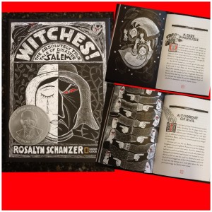
Australian Backyard Naturalist is what I have to know as typical informational book. However, I found another non-fiction children's book that was very unique in its visual language. Witches: The Absolutely True Tale of Disaster in Salem covers what the title suggests. Large clumps of text are broken up with gorgeous scratchboard illustrations. Modern and classical design are combined in this monochrome artwork by Rosalyn Schanzer. 
The artwork matches the gothic theme of the book and draws interest to the text.

building your own fly catchers, identifying birds to handling reptiles - See more at: http://www.howwemontessori.com/how-we-montessori/2014/02/on-our-nature-table-australian-backyard-naturalist.html#sthash.KfmuPXE4.dpuf


References:
http://theladybirdblog.typepad.com/the-ladybird-blog/2013/04/1-how-do-toddler-touch-books-differ-from-baby-touch-books-these-books-have-a-little-bit-more-going-on-in-them-in-ways-that.html#.UvzFsfZBFmA
http://www.janpienkowski.com/home.htm
http://www.usborne.com/

Friday 7 February 2014

Task 1: Jan Pienkowski - Further Detail

From Jan Pienkowski's website:
He co-founded the greetings card company, Gallery Five. He worked in advertising, publishing, and doing graphics for the BBC children's TV series Watch! In his spare time, he started to illustrate books for children. The books took over. He won the Library Association Kate Greenaway Medal in 1972 for his silhouette illustrations to Joan Aiken's The Kingdom Under The Sea and again in 1980 for Haunted House. He was to use his silhouette technique to dramatic effect in other books like the Fairytale Library.

I have decided to look further at Jan Pienkowski, illustrator of the Meg and Mog books. I selected this illustrator because his colourful artwork made up a good section of my childhood and I remember enjoying his bright colours and quirky characters as a young child. As a graphic designer, I now appreciate the strong compositions and use of line and shape which make up his work for this series. But  I was also intrigued by his work for other books, which are very different in visual language than Meg and Mog.


Meg and Mog was first published in the 1970's. These books feature a witch, Meg, her cat, Mog and sometimes their friend, Owl. Written by Helen Nicoll, their storyline is fairy simplistic and usually involves Meg's spells going wrong.


Pienkowski's illustrations for Meg and Mog are distinctive in their visual language. They are simplistic, drawn from only a few shapes and lines. The use of shape make each character distinctive; Meg is made up of sharp points, seen with her nose, robes and hat. Mog, in contrast, is made of curves and is seen to look fuzzy with the simplistic lines that wrap around the cat's body. Owl is meanwhile made up of soft circles.


The bold, clear and contrasting colours make the illustrations pop and appeal to a young audience. Very young children find it difficult to differentiate between similar shades of colour, making these contrasting colours educational and appealing from a young age.


The typography of the title matches the quirky illustrative appearance of the characters, while the inside text is a curvy sans-serif font that is easy for children to read.


The age range of these books are about 2-5 years. From looking at amazon reviews, I noticed that 2-3 year olds seemed to be the main target audience, though other parents wrote of their 4-5 year old children also enjoying the colourful tales. The use of colour is certainly what appeals to this young audience, as well as the fairly simplistic storyline and illustrative visual language.

---

Jan Pienkowski also produced illustrations for other books, such as The Kingdom Under The Sea, Nut Cracker, The Fairy Tales and A Necklace Of Raindrops. He produced delicate silhouettes for these books, which were more subtle and detailed than his work for Meg and Mog, making them suitable for a older child audience.


---

Pienkowski also produced books for a very young audience, which used a similar visual language to the Meg and Mog books. These books were educational and introduced children to a number of different concepts, such as colour, homes, weather etc.

I remember the following book from my childhood:

References:
http://www.janpienkowski.com/home.htm

Task 1: Four Picture Book Illustrators

Jan Pienkowski

 
Jan Pienkowski is a children's illustrator whose work for Meg and Mog, authored by Helen Nicoll, featured heavily in my childhood. I was surprised to discover his work for other books, which are far more detailed and different in appearance. Silhouettes feature heavily in these illustrations, lending a wonderful delicate, dramatic look. In the Guardian's interview it explains that Pienkowski, "cuts them (silhouettes) out in card, before scanning them in and manipulating them on a computer."

Nut Cracker


The Kingdom Under the Sea
Baba Yaga

Meg and Mog 
Jan Pienkowski is, however, most well known for his vibrant, bold and simplistic illustrations for the series Meg and Mog. Bright primary colours create a backdrop for the monochrome characters and the use of shape is crucial to their personalities. 


Work in progress:
Meg and Mog have even been converted into a television series for CBeebies:


Nick Sharratt

Nick Sharrott was one of my idols growing up. I mainly knew his work from one of my favourite authors at the time - Jacqueline Wilson, who he still illustrates for now. He has also produced work for a younger audience, as well as writing and illustrating picture books. His work is bold, bright and has a pleasing cartoon-like appearance, which appeals to the young target audience. His illustrations are fun, with faces made up of simplistic lines and the vivid colouring drawing attention. His illustrations also feature in the TV adaption of Jacqueline Wilson's The Story of Tracey Beaker.


Dick Bruna

Dick Bruna is a Dutch illustrator, artist and graphic designer. Though he is most known for being a picture book illustrator, Bruna also designed a series of posters for his father's publishing company, which highlighted his graphic design influence.


He is best known for Miffy the bunny, which he drew with heavy graphic lines and simplistic shapes. Indeed, the soft, non-threatening shape of Miffy, the circular head, the stout body and the cross of her nose has become iconic. Bold, primary colours have again been put into use to attract the attention of the young target audience.


Dr Seuss
Dr Seuss is amongst the most famous picture book illustrators and authors in the world. He wrote and illustrated a series of picture books that were fun, bizarre, lovable and rhyming! Such books were The Cat in the Hat, Green Eggs and Ham, Fox in Socks and many more. His illustration style is not as typical. His drawings are made up of loose lines, more illustrative in appearance than bold and graphical. He uses these lines to convey the emotions of his characters, as well as their sound and movement. He worked with ink and his characters would usually be highlighted with only one or two (often primary) colours. He was said to be a perfectionist and would sometimes spend a year on one book.


References:
http://vulpeslibris.wordpress.com/2009/12/18/the-nut-cracker-by-jan-pienkowski-and-david-walser/
http://vulpeslibris.wordpress.com/2012/02/09/the-kingdom-under-the-sea-by-joan-aiken-and-jan-pienkowski/
http://www.janpienkowski.com/home.htm
http://www.theguardian.com/books/2008/dec/22/pienkowski-nutcracker-illustrations-meg-mog
http://nicksharratt.com/
http://www.nijntje.nl/
http://nandawilson.wordpress.com/2012/11/17/picture-book-3-dick-bruna/