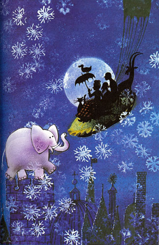
He co-founded the greetings card company, Gallery Five. He worked in advertising, publishing, and doing graphics for the BBC children's TV series Watch! In his spare time, he started to illustrate books for children. The books took over. He won the Library Association Kate Greenaway Medal in 1972 for his silhouette illustrations to Joan Aiken's The Kingdom Under The Sea and again in 1980 for Haunted House. He was to use his silhouette technique to dramatic effect in other books like the Fairytale Library.

I have decided to look further at Jan Pienkowski, illustrator of the Meg and Mog books. I selected this illustrator because his colourful artwork made up a good section of my childhood and I remember enjoying his bright colours and quirky characters as a young child. As a graphic designer, I now appreciate the strong compositions and use of line and shape which make up his work for this series. But I was also intrigued by his work for other books, which are very different in visual language than Meg and Mog.


Meg and Mog was first published in the 1970's. These books feature a witch, Meg, her cat, Mog and sometimes their friend, Owl. Written by Helen Nicoll, their storyline is fairy simplistic and usually involves Meg's spells going wrong.

Pienkowski's illustrations for Meg and Mog are distinctive in their visual language. They are simplistic, drawn from only a few shapes and lines. The use of shape make each character distinctive; Meg is made up of sharp points, seen with her nose, robes and hat. Mog, in contrast, is made of curves and is seen to look fuzzy with the simplistic lines that wrap around the cat's body. Owl is meanwhile made up of soft circles.
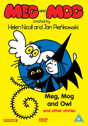
The bold, clear and contrasting colours make the illustrations pop and appeal to a young audience. Very young children find it difficult to differentiate between similar shades of colour, making these contrasting colours educational and appealing from a young age.

The typography of the title matches the quirky illustrative appearance of the characters, while the inside text is a curvy sans-serif font that is easy for children to read.

The age range of these books are about 2-5 years. From looking at amazon reviews, I noticed that 2-3 year olds seemed to be the main target audience, though other parents wrote of their 4-5 year old children also enjoying the colourful tales. The use of colour is certainly what appeals to this young audience, as well as the fairly simplistic storyline and illustrative visual language.
---


---
Pienkowski also produced books for a very young audience, which used a similar visual language to the Meg and Mog books. These books were educational and introduced children to a number of different concepts, such as colour, homes, weather etc.


References:
http://www.janpienkowski.com/home.htm
No comments:
Post a Comment