Tuesday 13 May 2014

Spine development

I had planned to have the zigzag pattern following onto the spine, like this:

 However, I didn't feel like it was the strongest effect. It looked awkward next to the front cover. Unlined and unbalanced. I therefore decided to change the idea by added a block colour, the lighter green taken from the front cover.
This was much stronger in my opinion. It balanced the front and back cover nicely, while also added an extra pop of colour.

As for the type for the spine, I wanted to communicate the same visual language and so used the same typography from the front cover. At first I coloured "Family" black, though this appeared harsh and out of place. By making it the same dark green as on the front cover, this united the overall appearance of my front cover.
I also added the "Local Food Lunches" logo, so that the reader knew who was the sponser. Luckily it went well with my design!
Barcode and pricing were also added.

Spiral Bound

After all the research I have done into children's cookbooks, the spiral-bound book kept appearing. I therefore felt it suitable for my cookbook to be spiral-bound. To mock this up in Photoshop, I scanned one of my textbooks in and edited from this photograph.


Sunday 11 May 2014

Front And Back Page Development

Experimenting with text for the front page:

I liked the typeface "Brushed", which looked to be made with a paintbrush, as it expressed to me creativity, something which I wanted to inspire in the children who read this book.


Scanned page. However, when I used the same sizing as the inside of the book, I realised that this was too short. I therefore added extra details to the bottom, which I think made it look more exciting anyway. 
Extra items added.
Text added. Patterns also added around text to keep the same visual language.

AFTER USING TESTING
Someone commented that the chef was hard to see because it was white on a white background, so I added an outline. I also made the stalk of the broccoli more green so that it stood out more.


Back page:

Easy Cheesy Eggy Bread Recipe Development

 Layout plan. Seasonal food icon under ingredient list. Colours - bright orange and more pastel yellow - relates to egg, the main ingredient to this recipe.


 I decided to make my cookbook more portrait. This would allow it to function on an ebook too. Again, I was planning where to put everything for I wanted to make a balanced composition.

 Starting to take shape. I moved the seasonal icons so they running down the side of the page.
Photographs to show progress.
Small chunks of text (in Gills Sans) so that it is easily readable and not overwhelming for children.
Large photograph to show the final result.
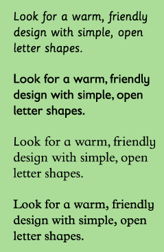
Playful typeface for the headings.
Games included - noughts and crosses to play while waiting.
Character also involved - for children to engage with.
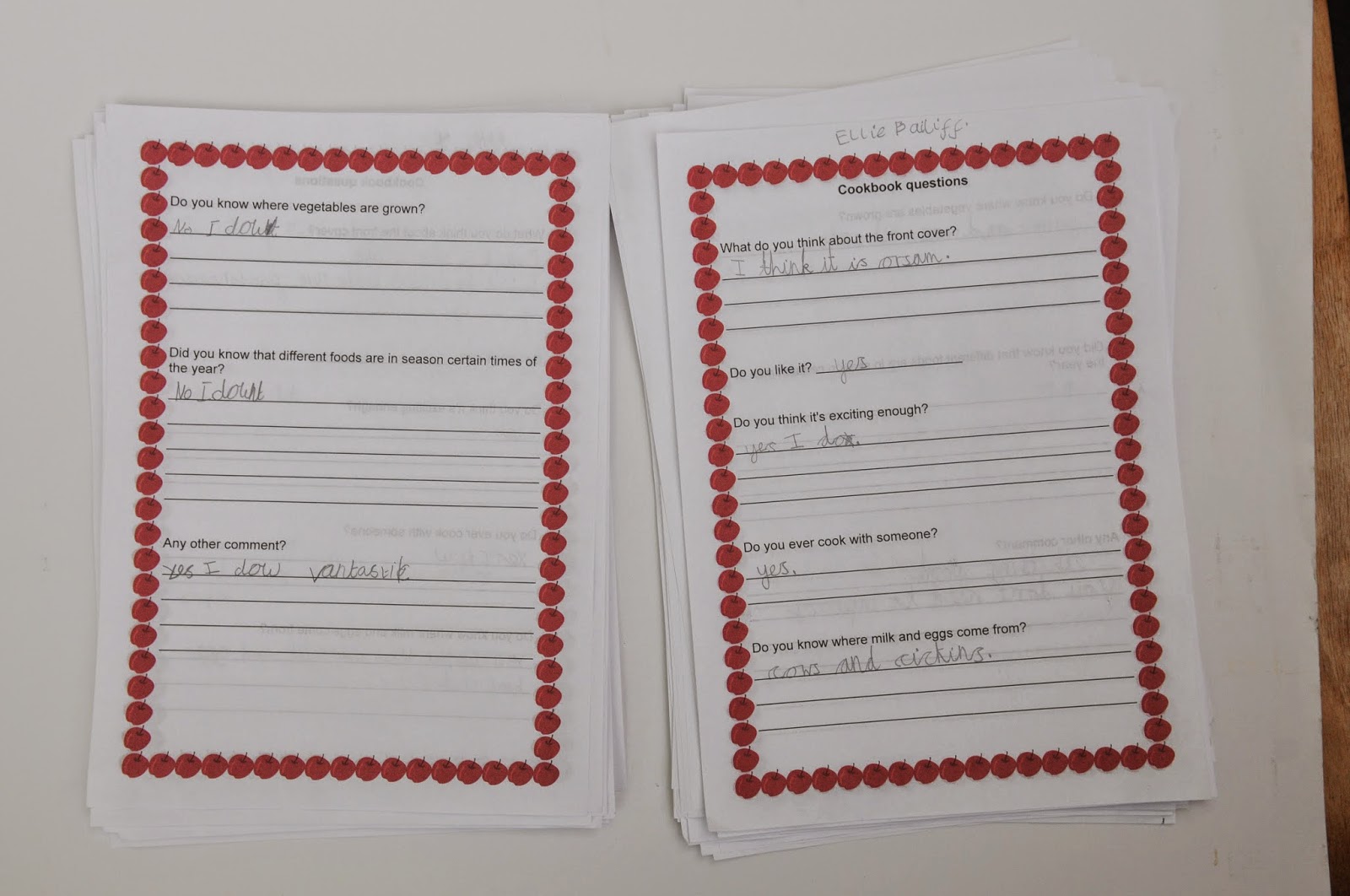
Pattern for the borders, which the children can colour in if they like.


- I did experiment with colouring the border, thinking it would add more colour. But I think the page has enough colour without it. Overall, I felt that it would be best to leave them blank so that the children could get involved by colouring them in.


- Added yellow boxes to add more colour to the page.
- A did you know interesting facts included to educate children.
- Lined paper from textbook scanned and placed with the "Your Thoughts" section.


Broccoli Recipe Images

Photographs for my second recipe, Purple Broccoli Gratin.


Children's Typefaces Repost

(Repost... This post wasn't showing up. Not sure why.)

Because I was designing for a young audience, I had to research which typefaces would be suitable for children.

On Kidstype.org it is noted:
There is no research that says that either serif or sanserif typefaces are intrinsically more legible. Teacher opinion, generally, favours sanserif typefaces because of the simplicity of the letter shapes.


On Fonts.com it says that children look for warm, rounded friendly typefaces. Exaggerated letter shapes are easily distinguishable.
 Typefaces with  larger x-heights are easier for children to read. A's and g's are good letters to look out for, for there is specific style to these letters when they have been designed for children. Seen below.

Condensed and expanded typefaces make it hard for children to read. So did very bold or light typefaces.

Sassoon Primary is a font that is specifically designed for young children, as well as Gills Sans Infant, Bembo Infant and Plantin Infant.

 
Letter Fountain notes:
In general, it is true to say that some typefaces are less suited for particular uses while others are specially designed for them. Gill Sans, for example, is very popular for children’s books because it is a humanistic lineal. Distinct shapes with sufficient differences between the individual letters that, especially in the larger font sizes used in books for small children, are more similar to teaching material than seriffed types.
And:
A few typefaces used for children’s books and texts for the visually impaired and dyslexic. Gill Sans is often used for children’s books because of its mild character. APHont was specifically designed for the visually impaired. Tahoma and Comic Sans are considered easily accessible alternatives by interest groups for the visually impaired.

Encouraged by this, I decided to use Gill Sans for the body text of my cookbook, as it can be read easily by children.


It is also important to keep line lengths short. Large chunks of text can appearing intimating.

Headlines can be more playful in colour and style, as there are fewer words to read. Creative fonts can therefore be used to attract the attention of a young reader through headlines.

For my headlines, I looked at numerous typefaces. (Seen in my Learning Journal) but ultimately decided on a quirky typeface called "InBetween". It appears almost hand-drawn, rushed in the nicest way, which I think will appeal to young children. It is also cursive and playful.


References:

Friday 9 May 2014

USER TESTING

User testing was a crucial part of this module. I needed to make sure that my work was on the right track, that children understood and liked it. I therefore showed my work to schoolchildren (the majority were aged 7, some were younger at 5/6). This was very close to the age of my target audience so was therefore valuable information.


I had them fill out an answer sheet. Here are their answers:


All of the children knew that eggs came from hens and milk came from cows. To include that information in my book would be deeming them less intelligent, I think. Instead this information would be suited to be given to a younger audience. However, none of them knew about seasonal foods! This would be a good way to educate children on such things.

A lot of the children cooked with family members.

I received very positive feedback. Many mentioned that the designs were bright and fun. I especially liked the answer that the child liked the front cover because as the teapot had a pattern (aww!) They also loved the game aspect! Getting the children involved with the book, able to write on it and play with it etc. went down very well.

The photographs were also greatly liked. Having photos for references is perhaps better than illustrations, for you can accurately measure your steps against the detailed photographs rather than guessing with an illustration.

Children understood the seasonal symbols. 

The children weren't sure that the chef on the front cover was a boy or girl (I had also noticed this issues) however, they really liked this! They said it made the book for everyone. I therefore decided to leave it.

They particularly liked the bright red colours on the front page.

They also liked the arrows, as they said they represented to get cooking straight away. I think the arrows did their job by drawing in the audience.


A teacher and a teaching assistant also filled out the forms:


The teacher summed up the class discussion about the cooking book:
 Overall, I think it was very important to get this feedback to know that I was on the right track with my work.