Because I was designing for a young audience, I had to research which typefaces would be suitable for children.
On Kidstype.org it is noted:
There is no research that says that either serif or sanserif typefaces are intrinsically more legible. Teacher opinion, generally, favours sanserif typefaces because of the simplicity of the letter shapes.
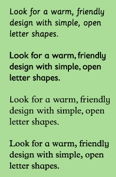
On Fonts.com it says that children look for warm, rounded friendly typefaces. Exaggerated letter shapes are easily distinguishable.
Typefaces with larger x-heights are easier for children to read. A's and g's are good letters to look out for, for there is specific style to these letters when they have been designed for children. Seen below.
Condensed and expanded typefaces make it hard for children to read. So did very bold or light typefaces.
Sassoon Primary is a font that is specifically designed for young children, as well as Gills Sans Infant, Bembo Infant and Plantin Infant.
Letter Fountain notes:
In general, it is true to say that some typefaces are less suited for particular uses while others are specially designed for them. Gill Sans, for example, is very popular for children’s books because it is a humanistic lineal. Distinct shapes with sufficient differences between the individual letters that, especially in the larger font sizes used in books for small children, are more similar to teaching material than seriffed types.
And:
A few typefaces used for children’s books and texts for the visually impaired and dyslexic. Gill Sans is often used for children’s books because of its mild character. APHont was specifically designed for the visually impaired. Tahoma and Comic Sans are considered easily accessible alternatives by interest groups for the visually impaired.
Encouraged by this, I decided to use Gill Sans for the body text of my cookbook, as it can be read easily by children.
It is also important to keep line lengths short. Large chunks of text can appearing intimating.
Headlines can be more playful in colour and style, as there are fewer words to read. Creative fonts can therefore be used to attract the attention of a young reader through headlines.
For my headlines, I looked at numerous typefaces. (Seen in my Learning Journal) but ultimately decided on a quirky typeface called "InBetween". It appears almost hand-drawn, rushed in the nicest way, which I think will appeal to young children. It is also cursive and playful.

References:
No comments:
Post a Comment