"First objects" book are educational as well as enjoyable for the young mind. They encourage babies/toddlers to grasp the concepts of day-to-day life. Some recurring features are:
- Bright, contrasting colours so that the target audience can distinguish between colours.
- Small, usually square books for small hands.
- Simplistic illustrations to make objects more obvious and identifiable.
- They can sometimes be tactile, in order to encourage interaction.
- A few words per page, usually one or two, as the target audience might not be able to read yet.
As mentioned in my previous blog post, Jan Pienkowski produced a set of "Nursery books", which introduce young children to certain concepts, such as the weather, food and time. The visual language is reminisce of his Meg and Mog illustrations, though with less text and larger, more simplistic and bold images. The colours are vivid and contrasting so that they catch the eye and are intriguing to this young audience.
Usborne produced a set of books that educate babies about animals. Some include textures for the child to explore on each new page and have colourful illustrations with that adopt exaggerated shapes that makes the animal more identifiable to the viewer.
Few words feature. The text explains what noise each animal makes, which encourages the child to join in with their parent and will help with their speech development.
3-6 Years - Picture Books
These books tend to get more advanced and sophisticated. There is a whole range of picture books, ranging from hand-drawn illustrations to bold and computerized graphics, yet most have the following features:
- When compared to the baby books, these picture books now have a more detailed and sophisticated visual language.
- The books are larger, as the children's hands have grown.
- Much more text to engage the child in the story. Parents can read it out loud, or older children can tackle the story themselves.
- Humour has been introduced, as well as morals and life lessons.
- Characters play a larger role and start to develop more personality.
- Texture, pop-ups, flaps and more interactive elements feature (especially toward the younger end of this bracket) to engage and excite the audience.
Marcus Pfister is a Swiss author who published The Rainbow Fish in 1992. The book focuses on the value of sharing. After being reprimanded for his vain, selfish actions, Rainbow Fish shares his shiny scales with other fish and delights in the joy that this gives his friends. The illustrations are soft, less contrasting than in the above baby books but far more detailed. The texture of the shiny scales is endlessly fascinating when you are young.
David McKee was a favourite illustrator of mine when I was younger and I would jump to read his Elmer books. These books also have a message. Elmer the elephant is very different in appearance to his friends and so this teaches us about diversity, individuality and acceptance. The colours are bright and colourful, matching Elmer's personality, while the typography is also fun and quirky.
9-11 Years - Information Books
- These books are educational and therefore contain more text than illustration.
- The illustration is more realistic, for it also often used for educational purposes.
- They encourage children to partake in activities and reward their interest in the world.
- They are typically not as bright in terms of colour.
- Small, sophisticated type and typefaces.
- Simple no-fuss layouts.
Peter Macinnis produced an award-winning book: "Australian Backyard Naturalist", which covers topics about insects, building your own fly catchers,
identifying birds, handling reptiles etc. The text is broken up by detailed illustrations. The composition is also interesting, not just straight up and down; images are presented on angles and overlap with others.
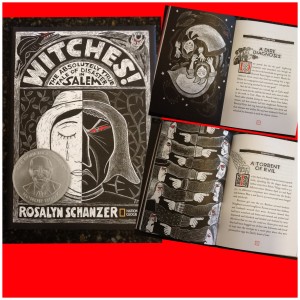
Australian Backyard Naturalist is what I have to know as typical informational book. However, I found another non-fiction children's book that was very unique in its visual language. Witches: The Absolutely True Tale of Disaster in Salem covers what the title suggests. Large clumps of text are broken up with gorgeous scratchboard illustrations. Modern and classical design are combined in this monochrome artwork by Rosalyn Schanzer.
The artwork matches the gothic theme of the book and draws interest to the text.
building
your own fly catchers, identifying birds to handling reptiles - See
more at:
http://www.howwemontessori.com/how-we-montessori/2014/02/on-our-nature-table-australian-backyard-naturalist.html#sthash.KfmuPXE4.dpuf
building
your own fly catchers, identifying birds to handling reptiles - See
more at:
http://www.howwemontessori.com/how-we-montessori/2014/02/on-our-nature-table-australian-backyard-naturalist.html#sthash.KfmuPXE4.dpuf
References:
http://theladybirdblog.typepad.com/the-ladybird-blog/2013/04/1-how-do-toddler-touch-books-differ-from-baby-touch-books-these-books-have-a-little-bit-more-going-on-in-them-in-ways-that.html#.UvzFsfZBFmA
http://www.janpienkowski.com/home.htm
http://www.usborne.com/


No comments:
Post a Comment