Roald Dahl's Revolting Recipes
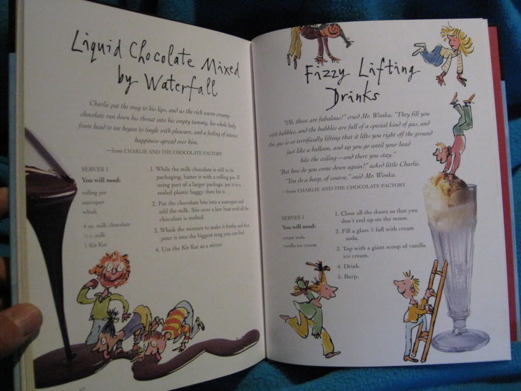
- Famililar illustrations have been put into use.
- Large sections of text. However, the illustrations stop this from appearing overwhelming.
- Colour brings life to the page.
- "What You Need" is usually displayed in a different section at the side.
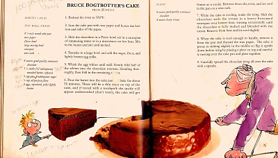
- Some images travel over the two pages, keeping a consistency.
- Illustrations are fun and creative. They oftern interact with the photographed food.
- Same typefaces used throughout. Playful and larger title, with easy-to-read body text.
Hungry? Innocent's Cookbook
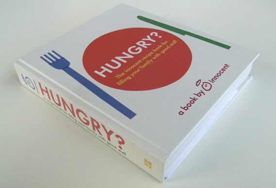
- Sophisticated visual language. Probably aimed more at the parents than children.
- The simplistic layout seems to be: text on one side, photograph on the other. No-fuss. Elegant.
- Recipes broken up with fun activity pages. These pages are very busy, with lots of illustrations. They seem to be aimed more at children, though perhaps slightly older children, around 7-10.
- Very creative book.
- Simple sans-serif type.
Kids' Fun and Healthy Cookbook
- Images joined with the "Ingredients" text.
- Warning triangles to show when you need to ask an adult for help, such as when handling knives.
- Photography mixed with text.
- Consistent layout through the double page spread.
Kid's First Cookbook
- Minimal text. Lots of photography.
- Photography is playful. Faces made out of meals etc.
- Simple, understandable layout.
References:
http://olyeats.wordpress.com/tag/roald-dahls-revolting-recipes/
http://www.creativereview.co.uk/cr-blog/2011/july/innocents-new-hungry-book
http://canadianhomelearning.blogspot.co.uk/2010/05/book-sharing-monday-kids-fun-healthy.html
http://www.dk.co.uk/nf/Book/BookDisplay/0,,9781405370905,00.html?/Kids%27


No comments:
Post a Comment