Fun To Cook Book

- Created to advertise advertise the Carnation Company, as the book uses several Carnation products in the recipes given.
- Illustrative style is charming. The red-headed girl is sweet and has a pleasing simplistic visual language. This young character would appeal to children, as they would be able to identity with her.


- Therefore, this book was designed specifically with children in mind.


- The language of the book is informal. As though it's a conversation between the character and the child cook.
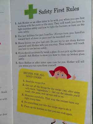
- The character appears throughout the book on post pages.

- These books are said to be aimed at children 7-9. Though I think even younger children would be able to enjoy the language and illustrations of the book, though they might need help with the recipes.
100 Yummy Things To Cook & Eat

- Each recipe contains a ‘You will need’ list, simple instructions, clear step-by-step illustrations and a photograph of the end result.
- Contains mainly treats, such as cakes and cookies.
- Photography mixed with sweet illustrations. Loosely drawn.


- Calming colours. Soft blues, yellows, purples pinks etc.
- Each page has a consistent style and layout.
- Language is very to the point, with no added frills. This makes it easier for children to understand.
The Children's Cookbook

- Published by Perrem & Cave.
- Playful front cover. Typography created from fridge magnets. Mixed with children's illustrations. Objects from a child's world.


- This book seems more designed for the parent and the child. The parent would be the one in charge of reading the instructions, helping the child.
- Soft pastel colours. Aimed at girls?
- Simplistic, to-the-point layout.
My Fun-to-Cook-Book

- Published in 1969 by Western Publishing Company
- Illustrated by Martin Mayhew.
- Loosely detailed, child-like illustrations. Messy, fun, carefree, bright - perfect for children.
- Seemed to have been done with coloured texta's, felt tips or magic markers.


- Characters such as a dog and cat (seen above) also appear, as children connect with characters more.

- Illustrations do not have to be polished or too finished to be attractive and successful.
 -
- How To Cook The Perfect Day

- Illustrations are similarly effective. Realism mixed with a cartoon style.
- This is a small book - 32 pages.
- By Nikki McClure, who uses x-acto knife to cut her designs into paper.


- Language is informal. Chatty.
- Text broken into different paragraphs; stops it looking like too much to read.
- Blue, black and white continue into the inside of the book. No other colours can be seen.
- Visual language is unique.


References:
http://goldcountrygirls.blogspot.co.uk/2011/04/vintage-childrens-cookbooks-2-fun-to.html
http://vanalogue.wordpress.com/2013/07/07/vintage-recipe-pamphlets/
http://www.usborne.com/catalogue/book/1~c~ccbc~6401/100-yummy-things-to-cook-and-eat.aspx
http://www.perremcave.com/portfolio/the-childrens-cook-book/
http://lucyking-bowerbird.blogspot.co.uk/2012/11/a-rather-quirky-second-hand-kids-cook.html
http://www.buyolympia.com/q/Item=how-to-cook-the-perfect-day
No comments:
Post a Comment