-
- Unique illustration style. Exaggerated proportions, such as face shapes, nose etc. Bright, engaging colours and visual language.
- Combining fairytales with cooking recipes.
- Story combined with recipes. Engages with children more.
- I like how they recipe and ingredients list are clearly laid out against each other. They are easy to read, with space between the lines to stop the text seeming like a plot. Small illustrations also surround them.
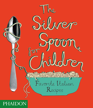
The Silver Spoon For Children
- Age range marked at age 10 and up.
- Published by Phaidon Press, 2009.
- Written specifically for children, with simple recipes.
- Encourages fresh and healthy ingredients, which relates to my brief.
- The book was developed by a specialist in the field of children's food and nutrition.
- Recipes usually take over a double page.
- Soft background colours.
- Loose illustrative style mixed with photography. Usually one photo per double page spread, of completed meal.
- I think that the typography is very strong in this book, as it relates well with the adjoining illustrations in visual language. It is also playful, therefore suitable for children's books.
Little Chef
- Described as a "quirky" children's cookvook.
- The recipes tend to be aimed at kids, involving "chess puffs", "fishfingers" etc. But I think encouraging kids to healthier, fresher foods could be a good thing.
- Bright colours mixed with numerous illustrations.
- "Cute" and "Sweet" - aimed at girls.
- I made not of the typography used. It is playful, close to being hand-drawn.
Picture Cook
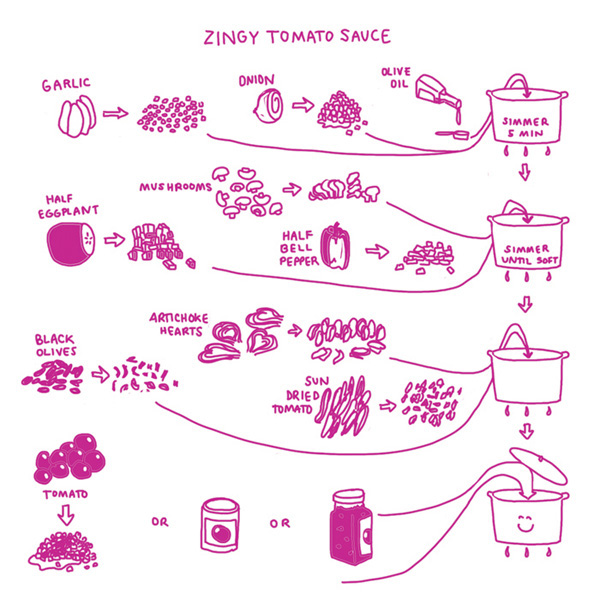
- I was particularly interested in this cookbook, as it uses info-graphics to put across information.
- Frills are cut-off with this book, which allows you, with a quick glance, to understand how to make a main meal.
- Bright colours for illustrations. Outlines. Against white background - stops it appearing overwhelming.
- The author and illustrator, Katie Shelly, had to involve using testing with the process of creating this book. She would get her friends to point out any parts of illustrations that they didn't understand and re-work them.
- She wanted to encourage people to have fun with cooking, to not be too precious about the process.
- As you can see from the "Sweet Potato Fries" recipe above, sometimes one or two words are added to the illustrations, but even then there are just that - one or two words. Because of the illustrations, that all the viewer needs.
50's Cookbook Illustrations
- By Bradley Huber.
- I love the clear, simple shapes of these illustrations. It's completely obvious what the images represent.
- Only green, blue and black have been used in these illustrations, which lends the 50's feel. I find the soft colours calming.
- Quirky, endearing, charming. Would work well in a cookbook.
- However, perhaps children would need more dynamism to entertain them.
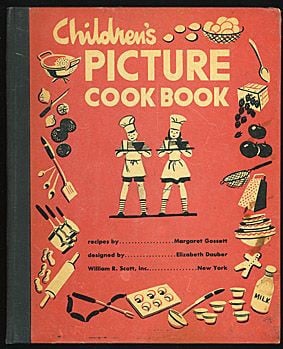
Children's Picture Cookbook
- Margaret Gossett.
- 1940s vintage cookbook. This can be seen clearly in the simplistic style and minimal colours.
- Easy-to-make recipes concocted with children in mind.
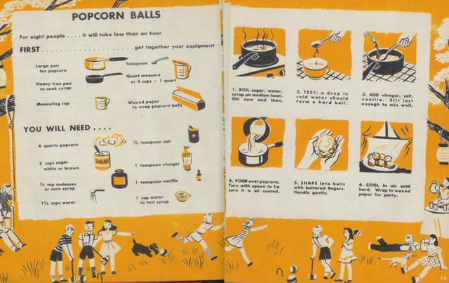
- Maximum of three colours.
- Each step is clearly illustrated.
- Background images of children playing.
- Minimal text so that it is not overwhelming.
- Understandable layout.
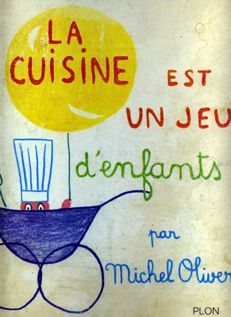
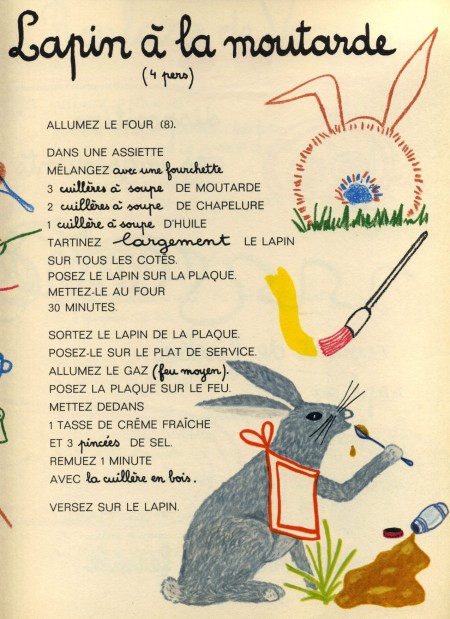
La Cusine Est Un Jeu D'Enfants
- By Michel Oliver
- French cookbook.
- Age-range is marked as 3-7.
- Ambitious recipes.
- Whimsical illustrations.
- Seen on this blog it explains about the book that the ingredients and the steps are kept to a minimum, but the flavors are complex.
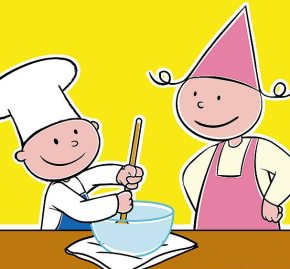
There is a modernized version, made into a TV series, which had fresher, brighter illustrations:
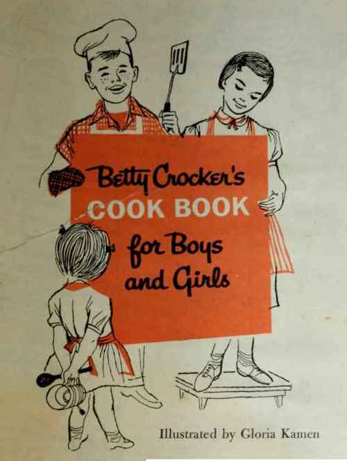
Cookbook for Boys
- Motherly vibe
- Illustrated by Gloria Kamen.
- Realism mixed with cartoon-like illustrations.
- Charming illustrations.
- Maximum of three colours used per page, though mainly black and white with splashes of colour.













No comments:
Post a Comment