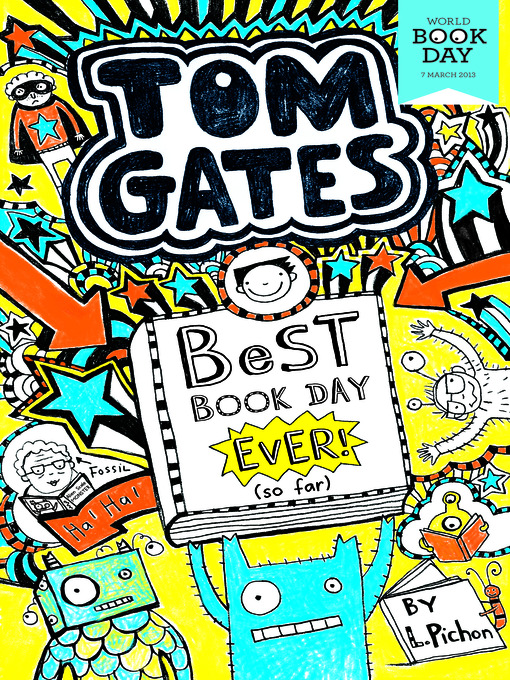
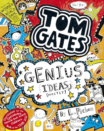
I also looked at books aimed at children, out from the genre of cooking books. The one that most caught my eye was the popular Tom Gates series by Liz Pichon.
Pichon's illustrations appeal to my target audience (eight year olds) as they are fun, vivid, chaotic and interesting. The images leap out the page and grab your attention. There is so much going on - and this will appeal to the young audience, who like having lots of focus on to stop them getting bored. Yet it stops from becoming overwhelming thanks to the consistent visual language and complimentary colour scheme.
I had the opportunity to visit a talk by Pichon. During the talk, she explained how she found the cover of the first Tom Gates book problematic to create. She had the idea of making the front cover similar to a text book, yet was given the advice that this just wouldn't "pop" on a bookshelf. It had to stand out amongst its competitors. She combated this problem by filling the pages with colourful doodles and this become an instant success.
The illustrations are given a hand-drawn, sketchy effect, which relates well to children, for it seems almost like something they would draw themselves.
The pages are bursting with interesting characters, scribbles and patterns.
Overall, I feel that Pichon has grasped what appeals this young audience and this is what makes her book series such a success.
References:
http://www.lizpichon.co.uk/


No comments:
Post a Comment